SimplexSans is a modular, grid-based display typeface inspired by the era of manual lettering — a time when type wasn’t designed on screens, but drawn by hand with ruler and compass.
Concept
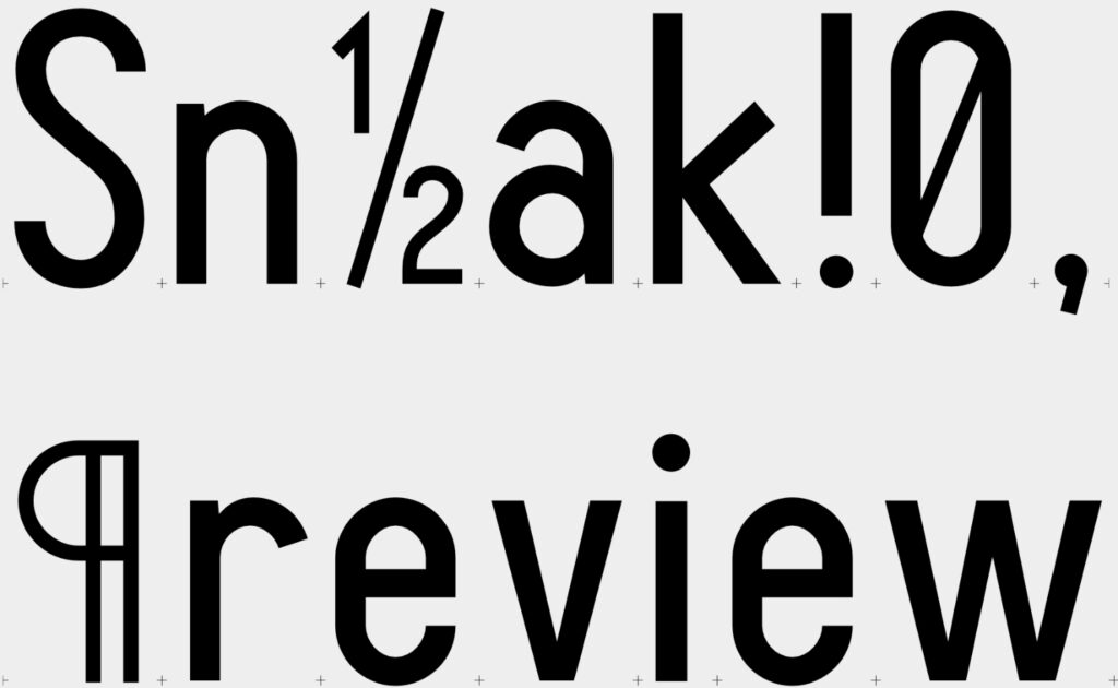
SimplexSans was developed as a typographic experiment rooted in analog construction techniques. Every glyph is based on a strict modular system, allowing the shapes to be drawn manually on graph paper using only a ruler and a compass. The result is a display typeface that feels both mechanical and human, rational and playful.
Design Characteristics
- Geometric, monolinear construction
- Based on a triospace grid system, no kerning!
- Normal characters (a, b, n, etc.) are 2 units wide, narrow characters (I, i, l, etc.) 1 are unit wide and wide characters (W, m, etc.) are 3 units wide
- Designed for display use: headlines, signage, editorial experiments
- Trispace font: to allow rhythmic typographic patterns without relying on variable widths or kerning
- No optical corrections — all shapes are purely constructed and follow the logic of the grid
- Special characters are typically drawn with half the stroke width
Technical Details
- No kerning — spacing is fully modularA simple font
- Character set includes: Basic Latin (A–Z, a–z, numerals, punctuation), essential symbols and selected extended Latin characters